Welcome to the latest edition of our top 20 sites of the month. In this February’s collection, the overall feel is lighthearted and optimistic, as we are seeing the positivity of a new year persisting across the web.
There is a continued inclination towards warmth and personableness and away from a more corporate, impersonal feel. We see this most in the color palettes used and in the use of illustrations as accents to add character and charm. Of course, as always, type plays a big part too. Enjoy!
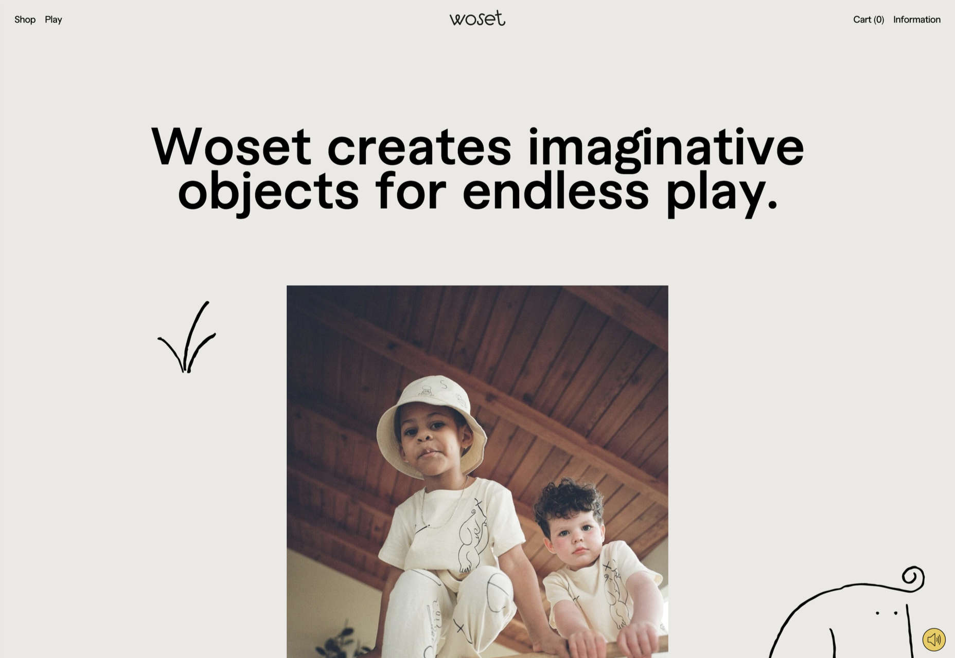
Woset
Woset has a simple aesthetic and features a charming illustration style on this site for its creative toys. The interactive ‘play’ section is a nice touch.
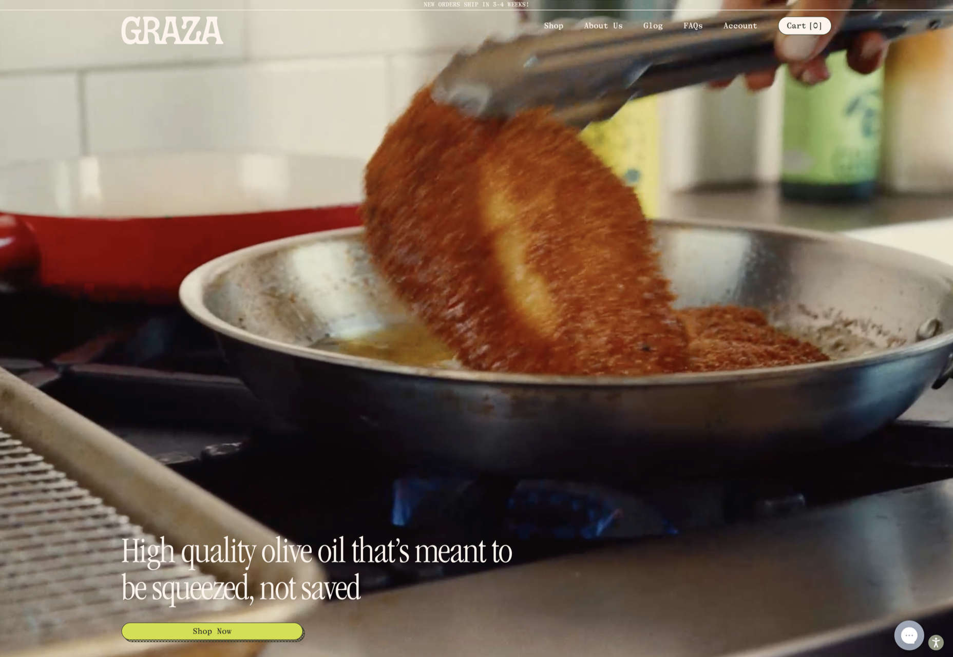
Graza
This site for Graza olive oil has a fun feel, with comic style illustration and bright splashes of color while making a serious sales pitch.
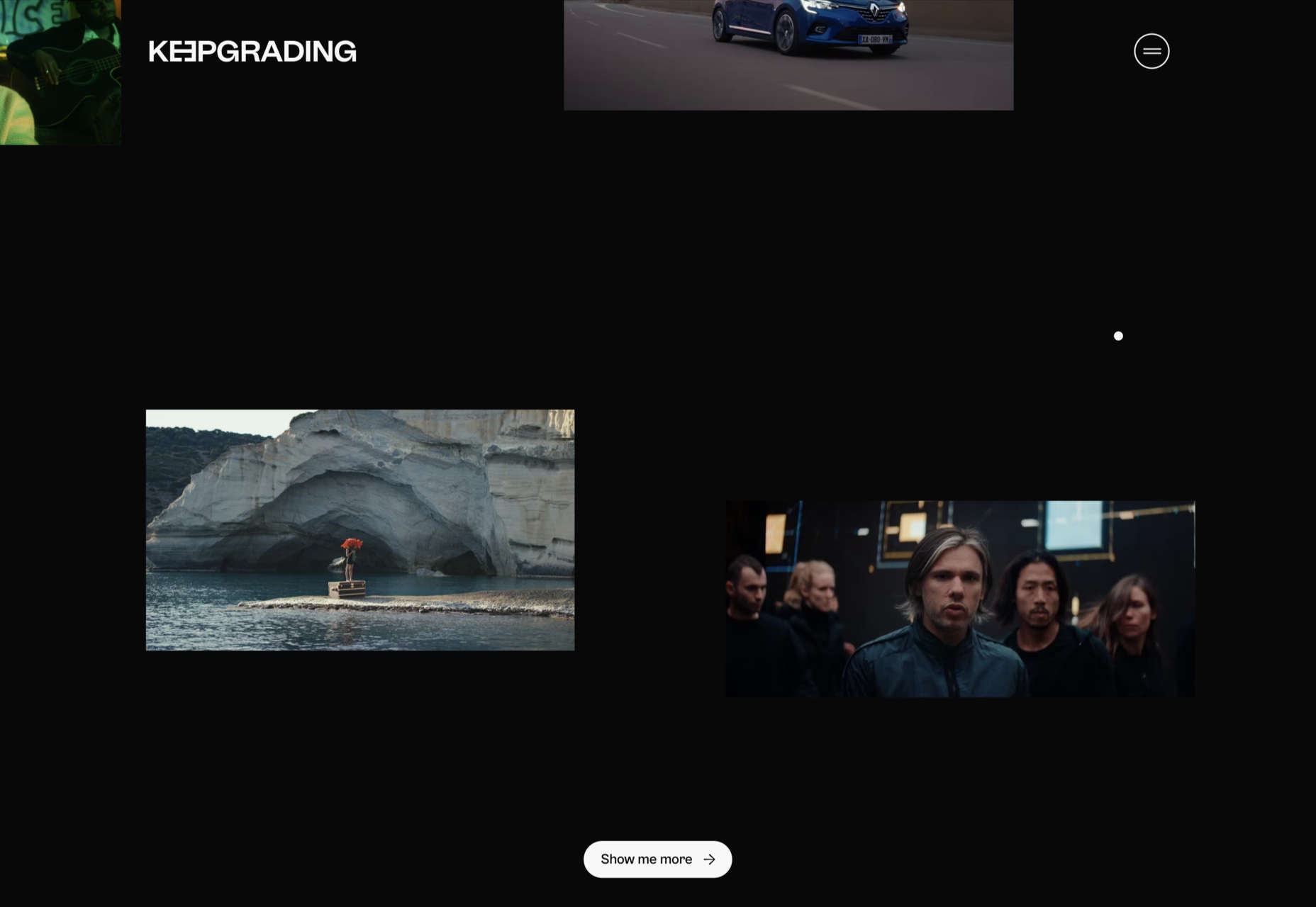
KeepGrading
KeepGrading is a post-production color studio. Their portfolio site showcases a lot of work but keeps it well organized and pleasing to navigate.
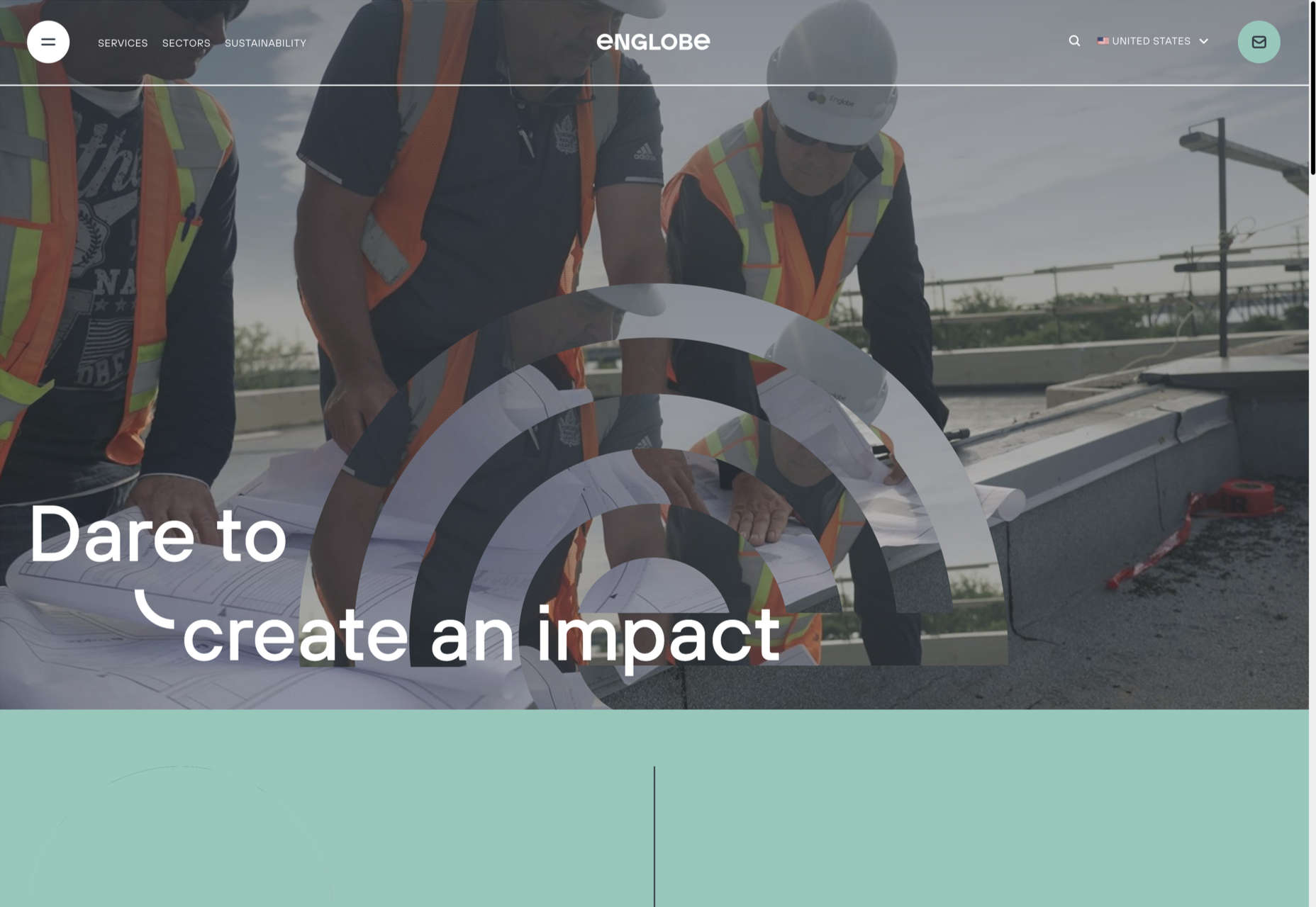
Englobe
By using soft colors and slightly rounded type, Englobe has managed to portray a warm, friendly, and human aspect with this website, despite being a huge company.
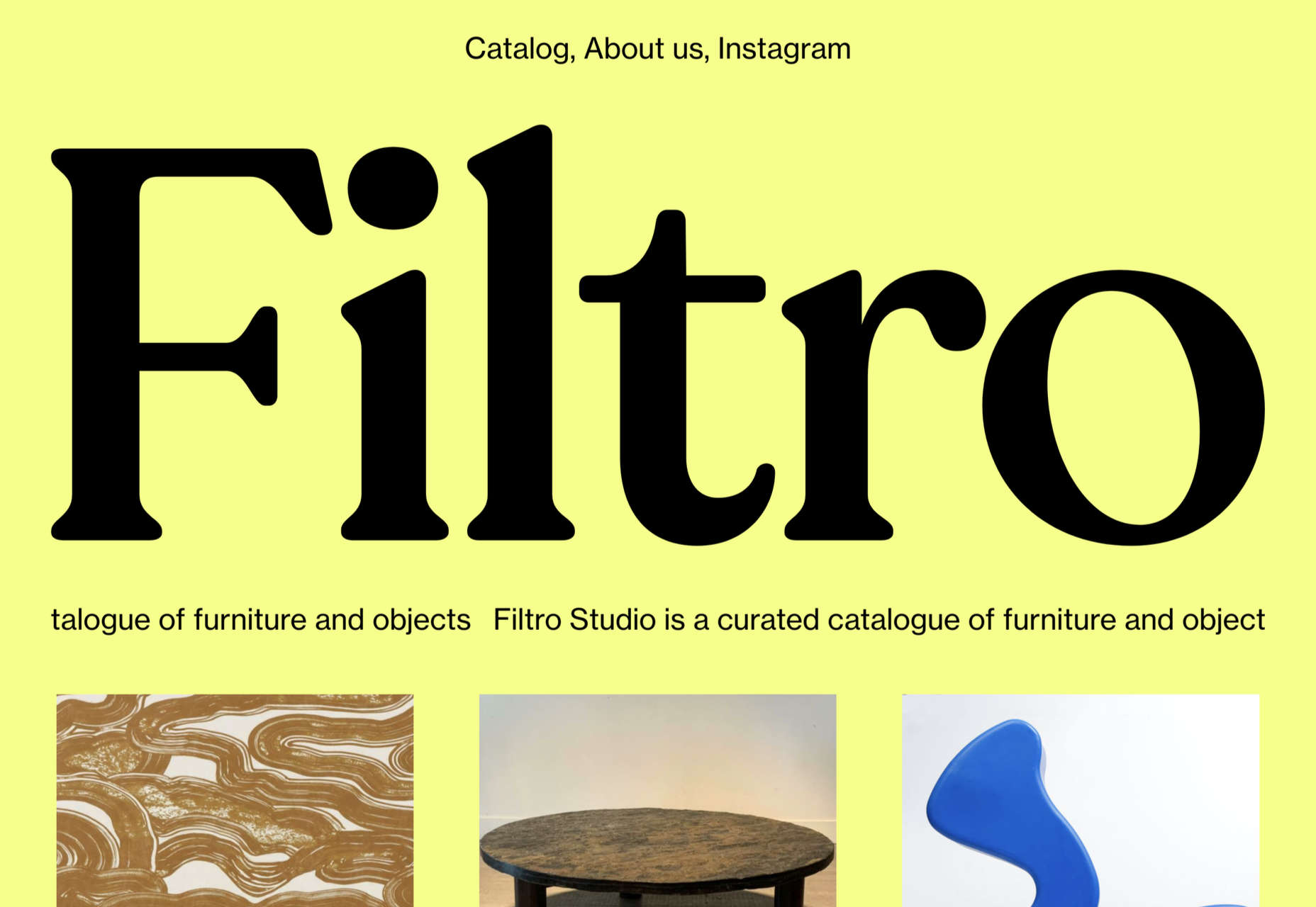
Filtro
Filtro’s design is about as basic as it gets, and yet it has a certain charm to it.
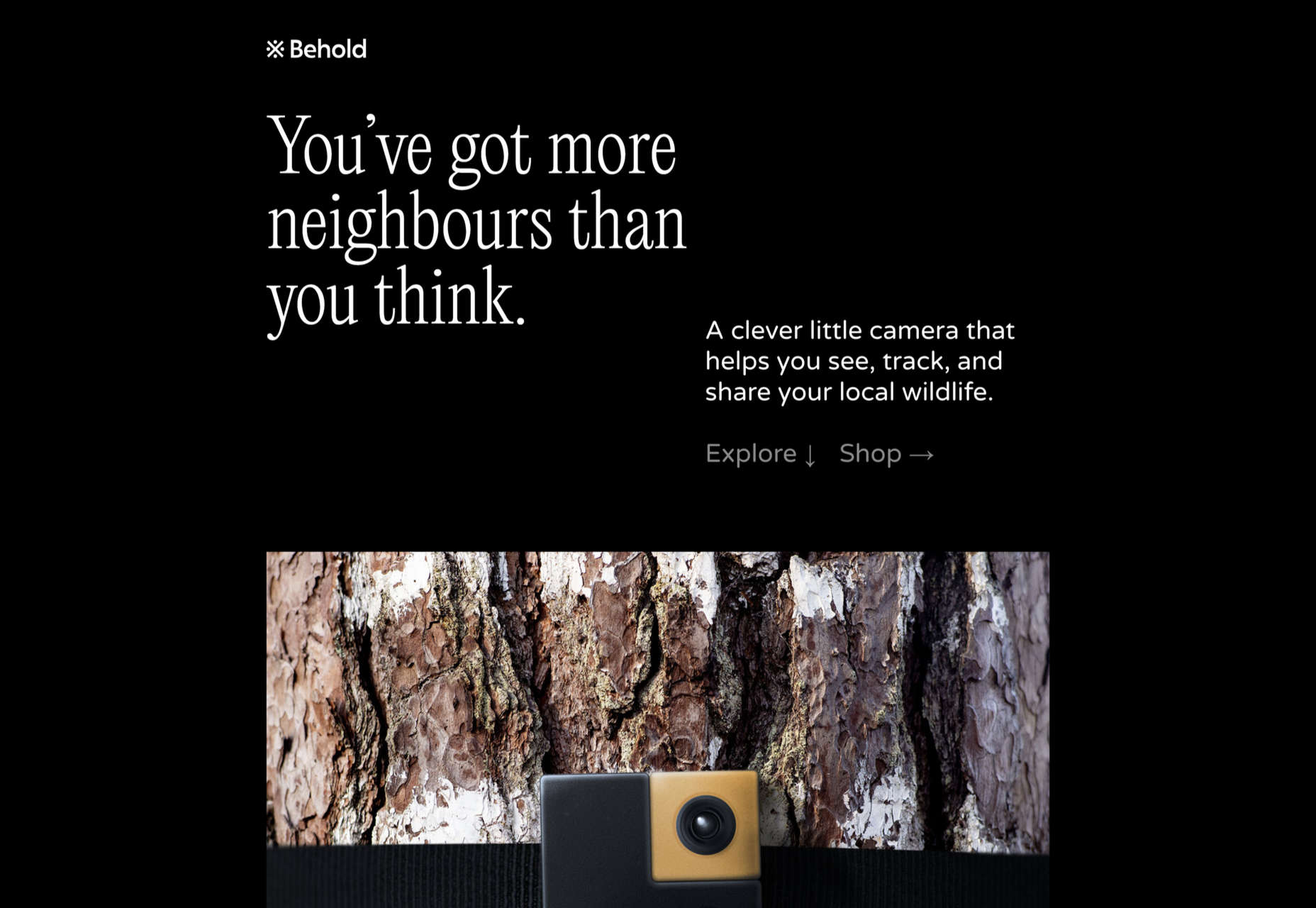
Behold
Behold is a wildlife camera that is currently in development. This landing page does an excellent job of creating interest with just enough information.
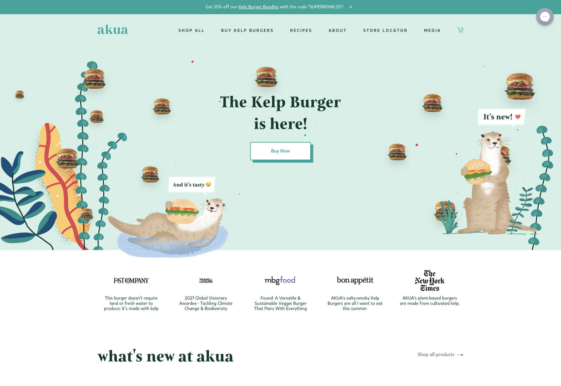
Akua
Some rather sweet illustration work creates a good balance with technical information on this site for Akua kelp burgers.
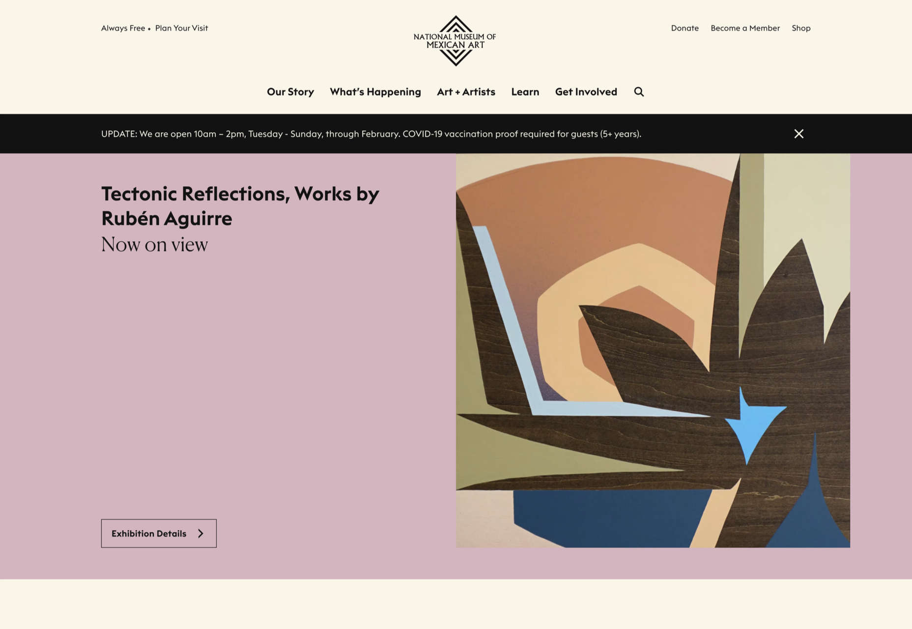
National Museum of Mexican Art
A color scheme of warm, earthy tones and a carefully thought-out type pairing create an inviting presence for the National Museum of Mexican Art.
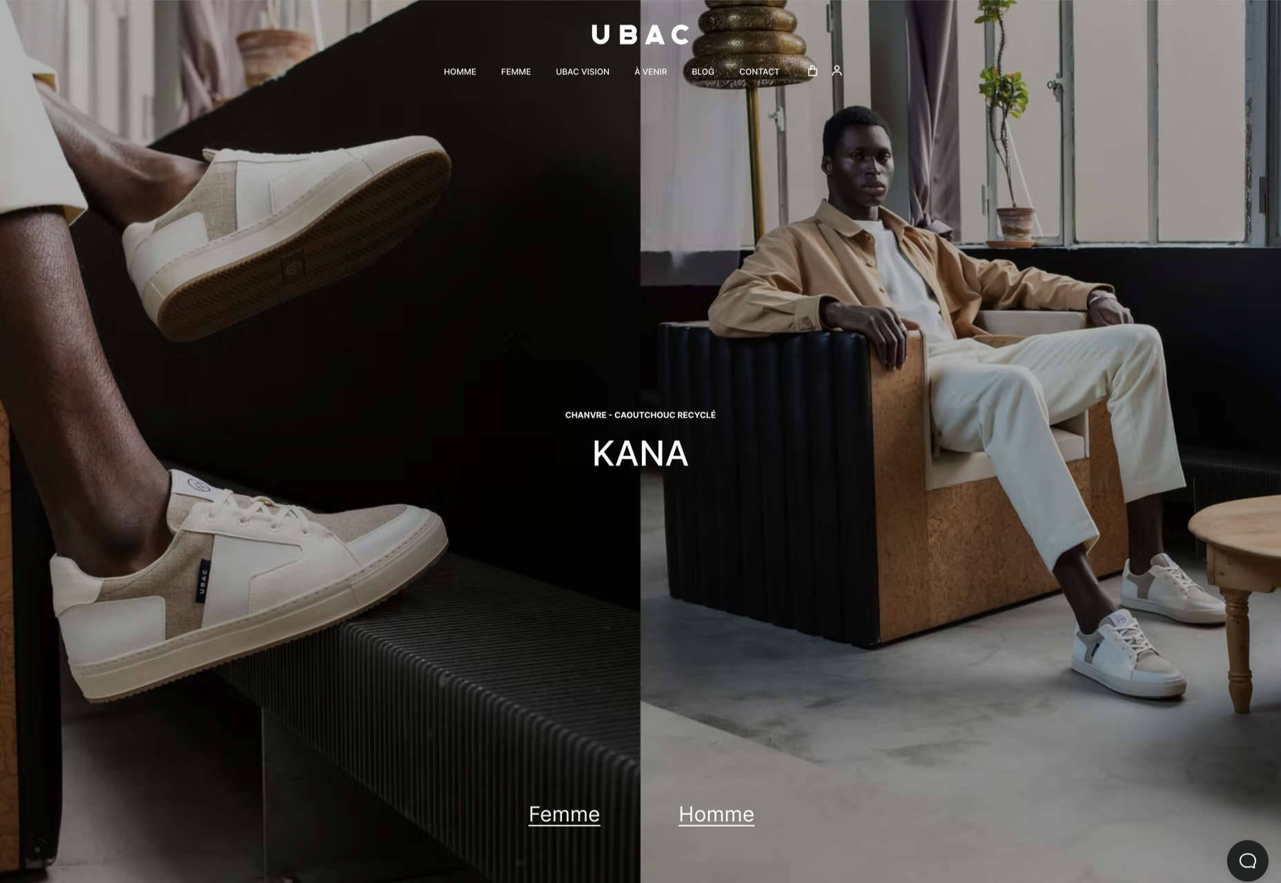
Ubac
This site for Ubac trainers feels clean and modern with some nice and mostly functional, scroll-activated animation.
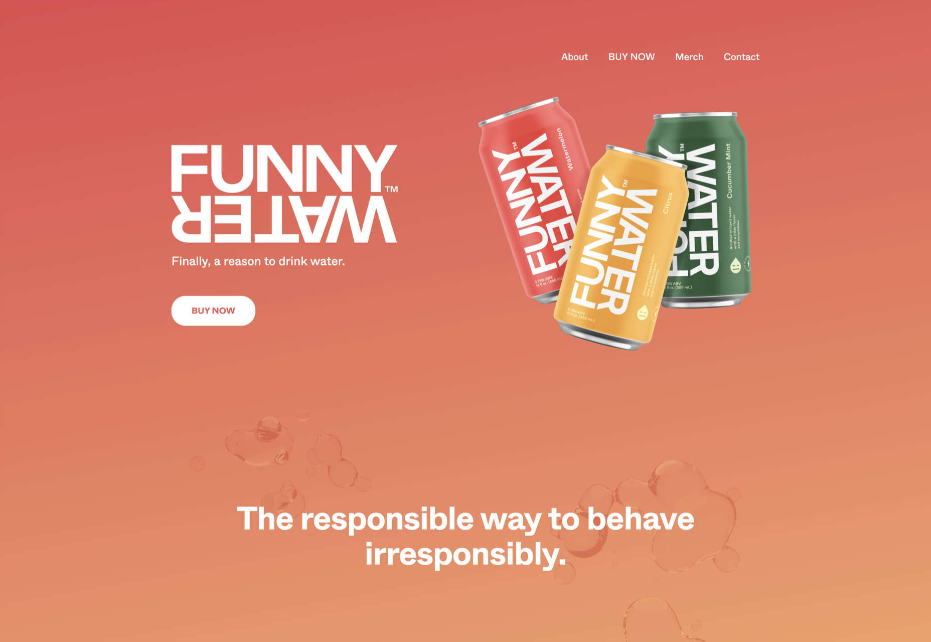
Funny Water
The background gradient is really nicely done on Funny Water’s otherwise very minimal site.
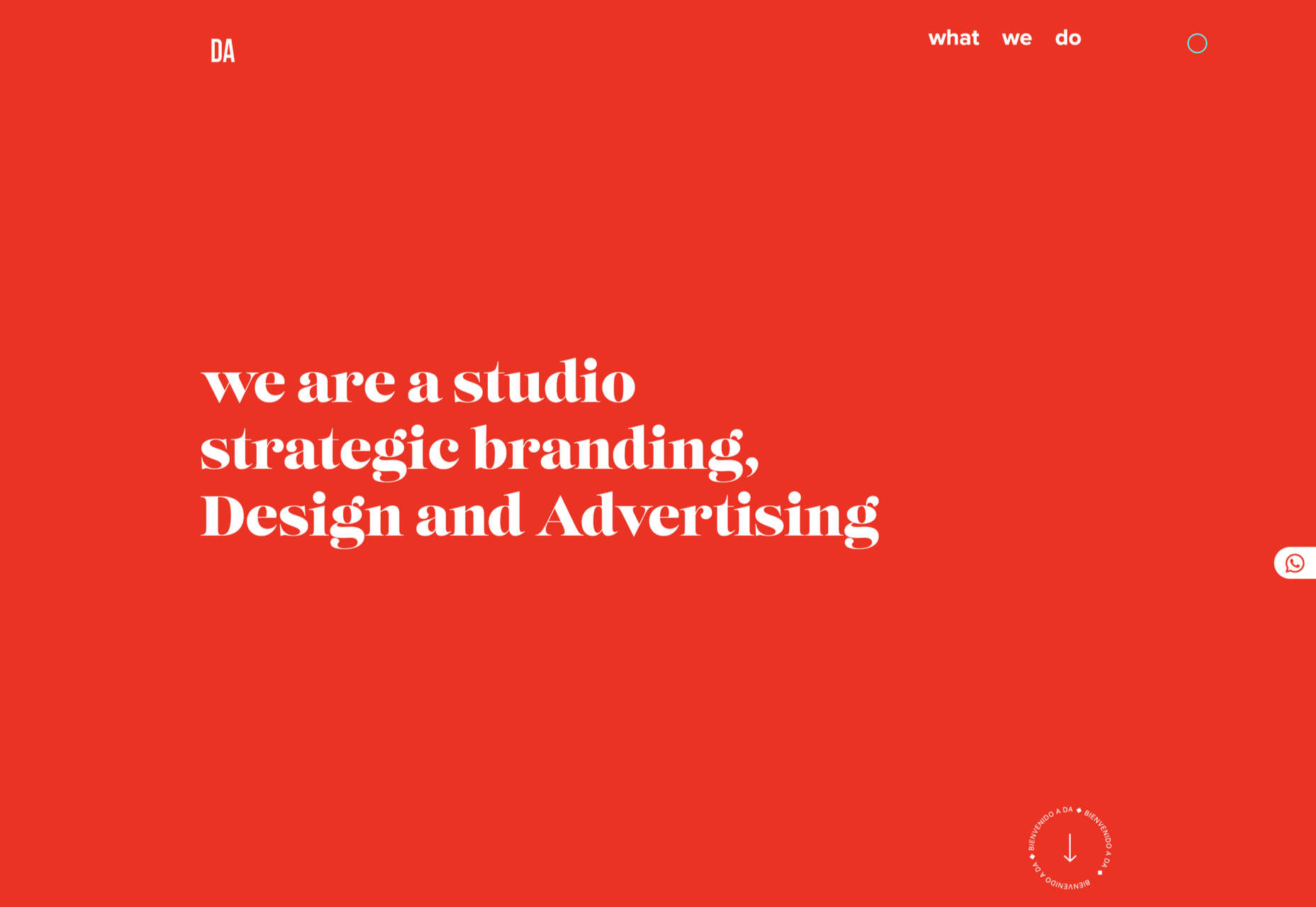
DA
DA is a strategic branding, design, and advertising studio, and this site is a good, polished example of a site for such an agency. What stands out is the clever menu text.
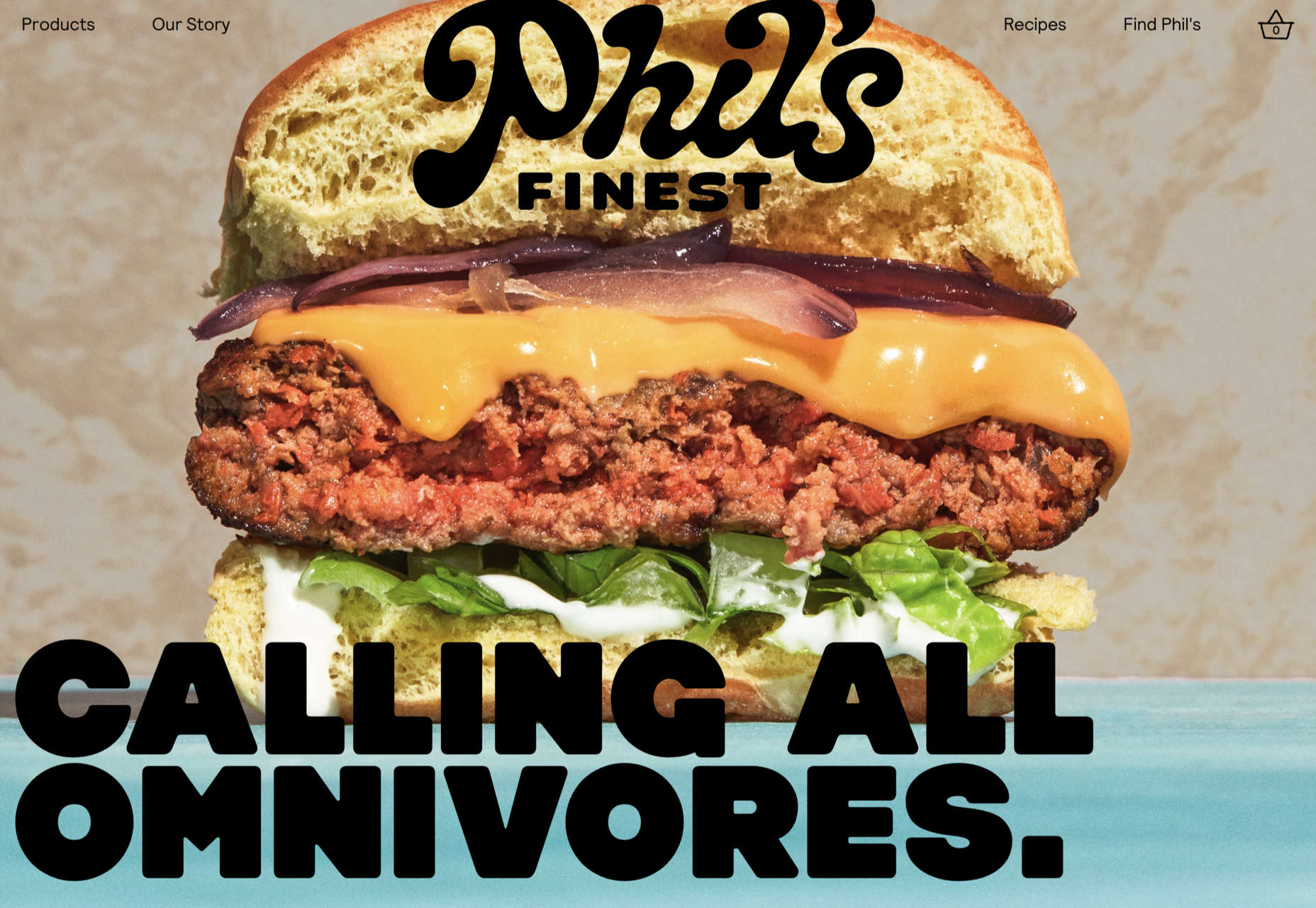
Phil’s Finest
Phil’s Finest makes good use of color, oversized type, and occasional illustration mixed in among the well-styled photography.
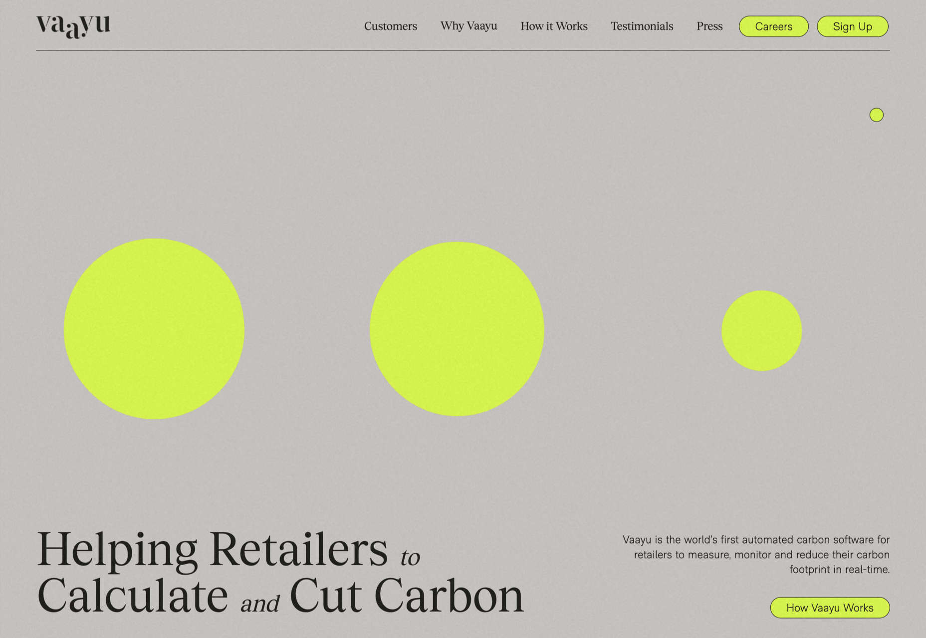
Vaayu
Grey and black are enlivened by neon yellow in Vaayu’s minimalist, single-page presentation.
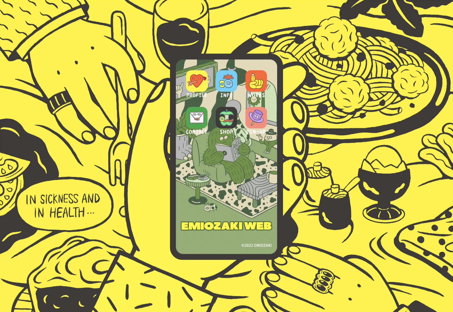
Emi Ozaki
Artist and illustrator Emi Ozaki has created a stylized phone interface for her portfolio site, which showcases her illustration aesthetic.
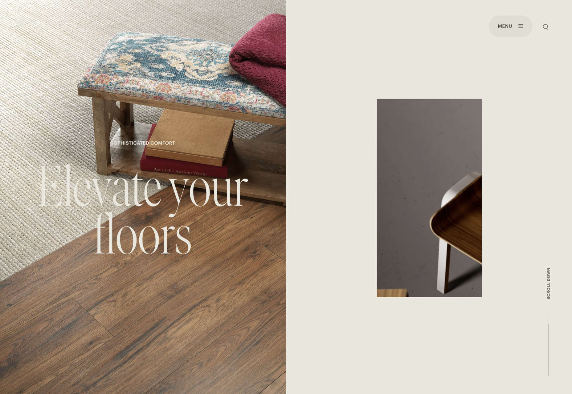
Engineered Floors
The home page scrolling is the centerpiece of Engineered Floors’ site, and it works especially well on mobile.
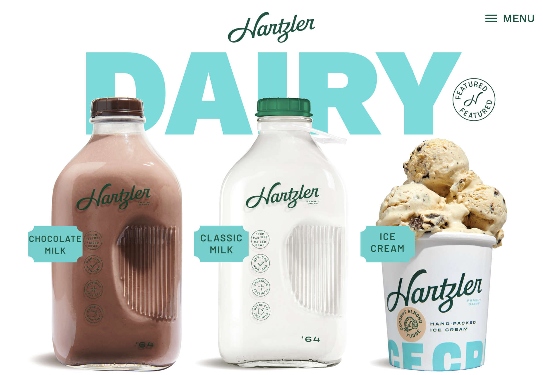
Hartzler Dairy
Hartzler Dairy goes for a nostalgic feel to match the company’s classic mid-20th century style branding.
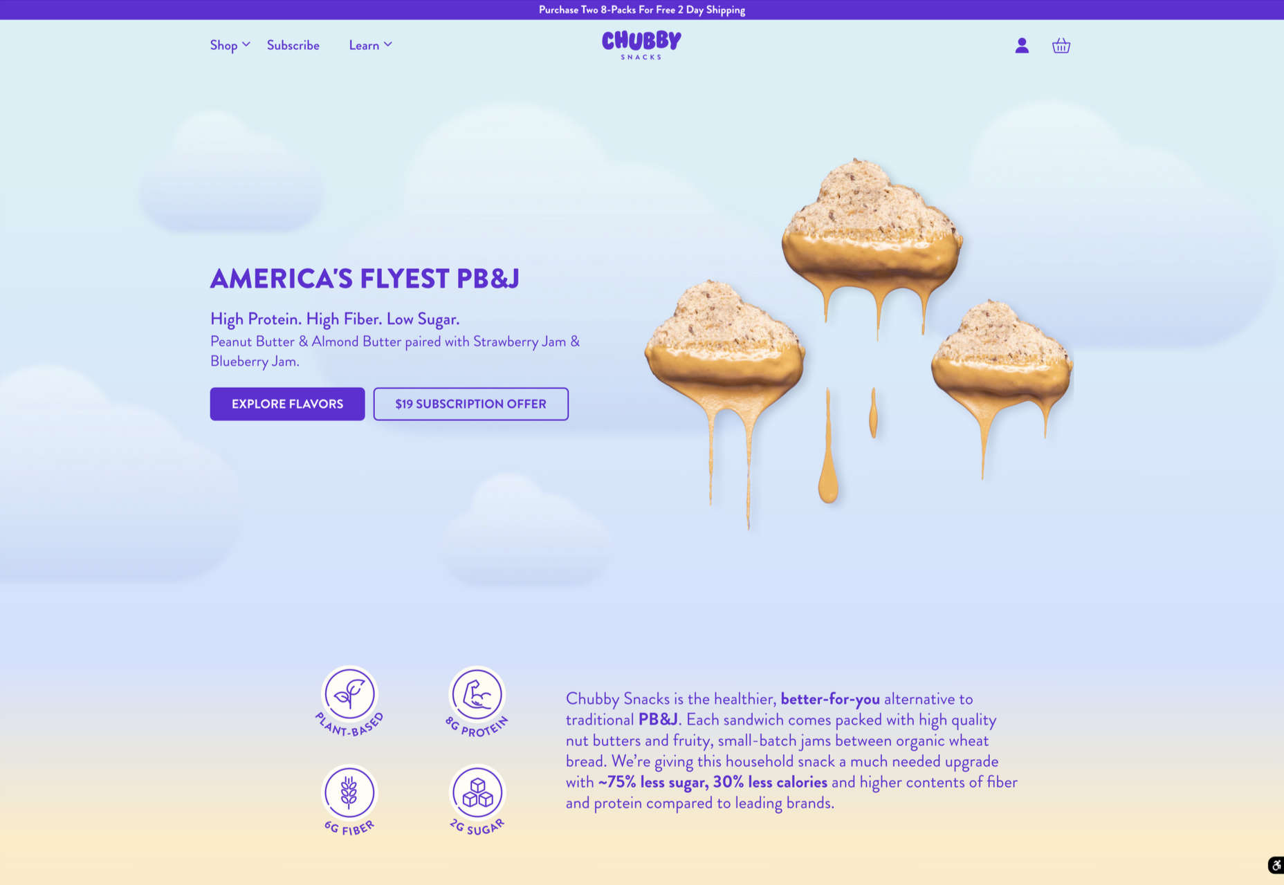
Chubby Snacks
Chubby Snacks is PB&J in your pocket; it sells itself! Having said that, the site is pretty appealing in its own right.
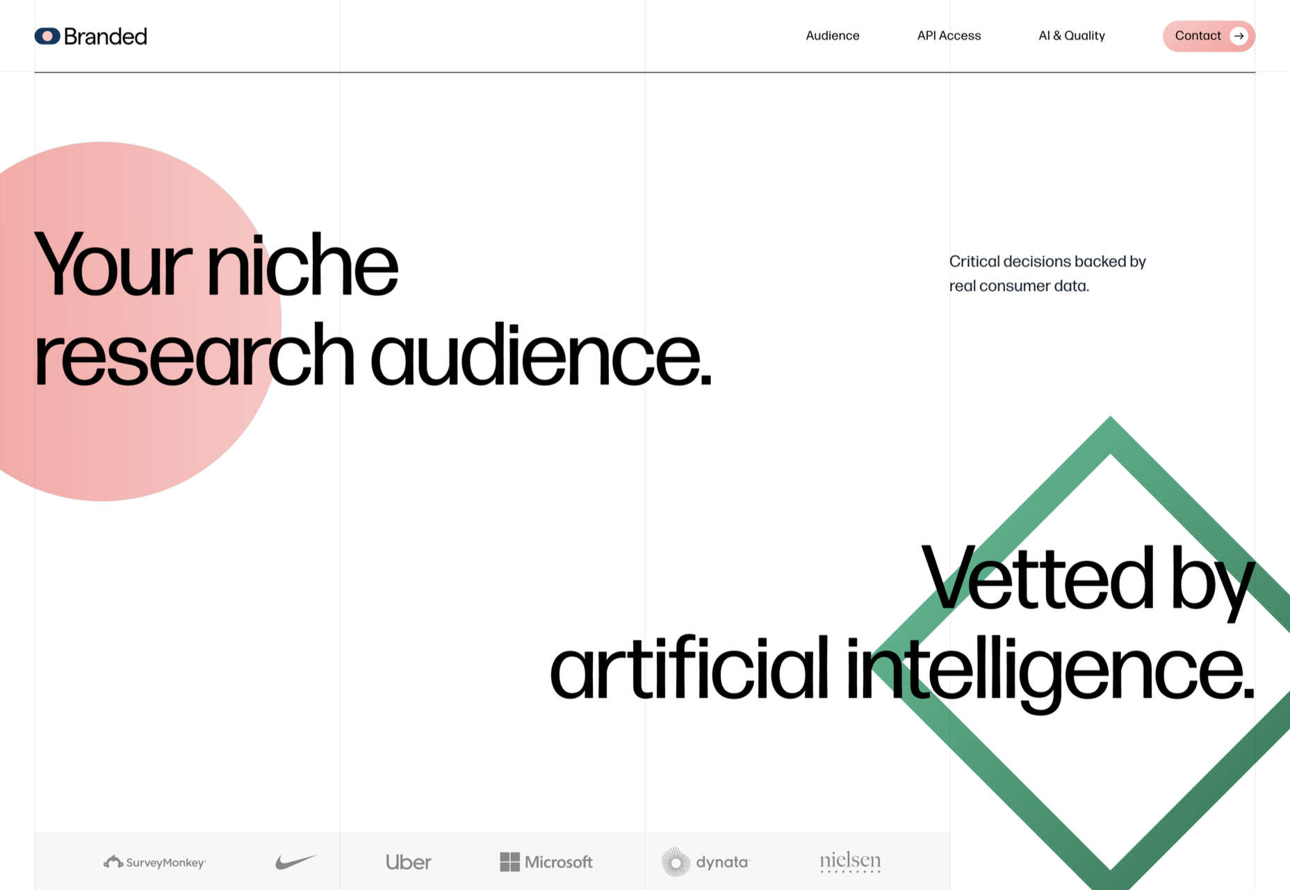
Branded
Market research company Branded goes down the flat design road for this site, which could feel a little dated but actually works quite nicely here.
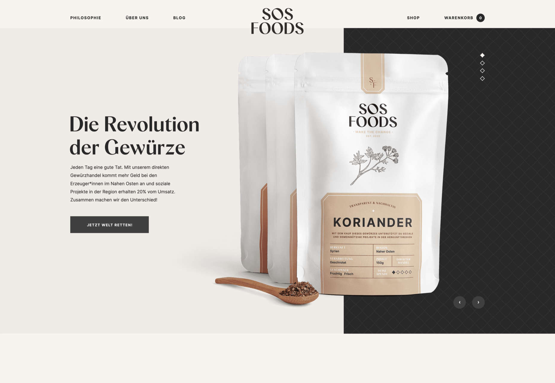
SOS Foods
SOS Foods is an excellent example of a responsible/sustainable goods site, with a design aesthetic aimed at the ethical consumer.
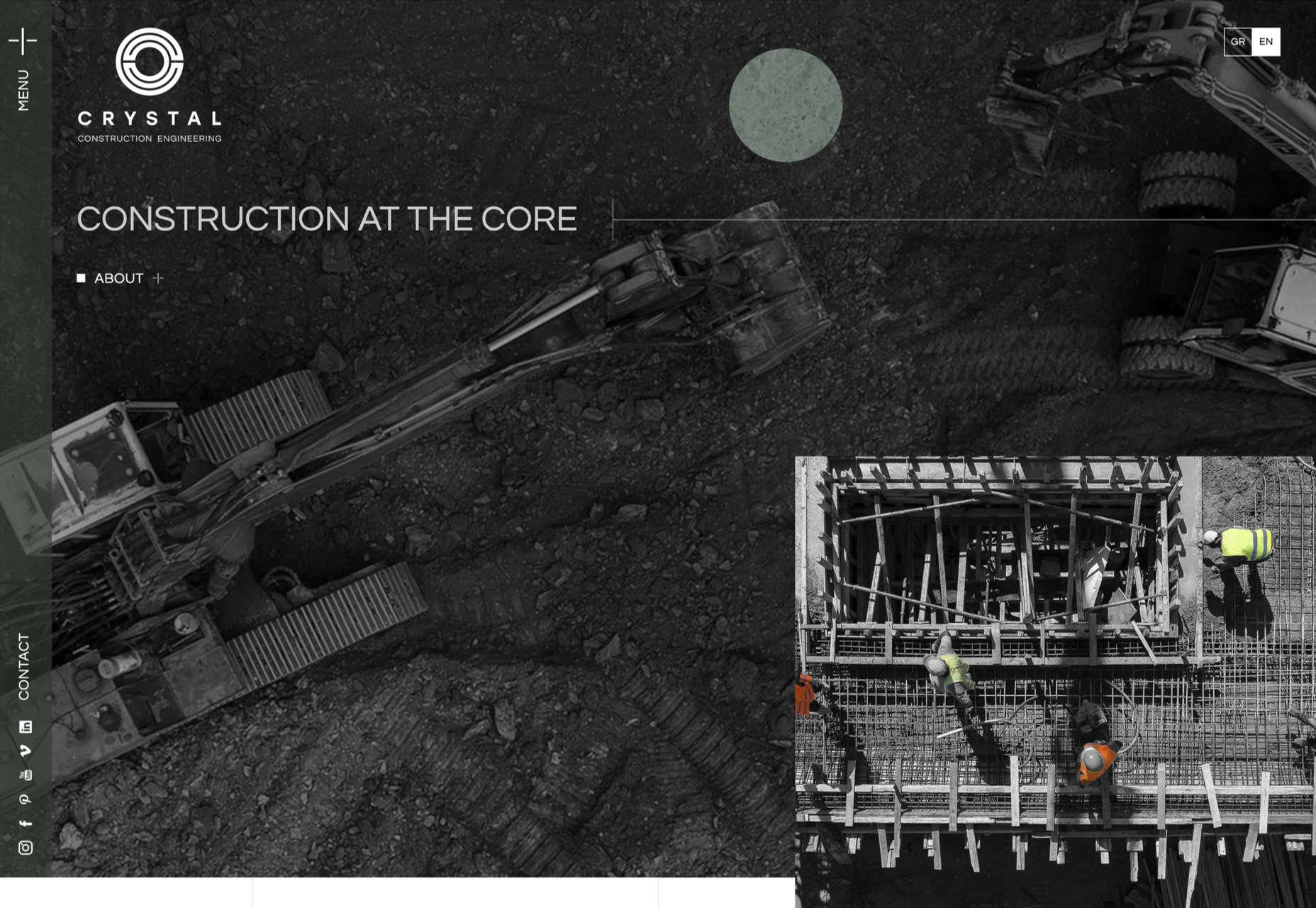
Crystal Construction Engineering
Some nice use of masonry-style layout and overlapping elements create space, but also a pleasing flow in this site for Crystal Construction Engineering.

