The author’s views are entirely his or her own (excluding the unlikely event of hypnosis) and may not always reflect the views of Moz.
What is “share of voice”?
Share of voice (SOV) in marketing originated as advertising terminology, defining the percentage of media spend by a company compared to the total spend in the market. In essence, it’s meant to gauge visibility of a brand compared to its competition. In the SEO world, it measures organic visibility compared to the rest of the search landscape.
Share of voice has been used in the SEO industry for years, but recently more SEO tools have begun incorporating it as an additional measurement alternative to simple rank tracking.
Rank tracking is extremely valuable, but when it comes to reporting and speaking with stakeholders unfamiliar with the minutiae of SEO, rank tracking can get people confused and caught up on a specific rank for one term at one point in time. Not to mention that search engines are extremely sophisticated now, and many factors can influence why a brand may rank position #1 in one location and position #8 in another.
Share of voice is an alternative measurement that brings rank tracking to a higher-level conversation about overall awareness performance.
I’d be remiss not to mention that share of voice is just one metric to incorporate. Good SEO measurement dives deeper into the business impact of the channel, But including SOV can be a great way to discuss overall awareness, which is an important step in the funnel to sales and conversions.
How is SOV calculated?
Share of voice is typically calculated as (Position Click Through Rate X Search Volume) / Total Volume summarized for all keywords. This allows higher search volume terms to make a bigger impact than those with lower volume.
For example, if you rank position #3 for a term with 1,000 monthly searches and position #1 for a term with 100 monthly searches, you would do the following math to get SOV:
-
Keyword 1: Position 3 CTR 9.25% * 1,000 = 92.5
-
Keyword 2: Position 1 CTR 34.76% * 100 = 34.76
-
Total SOV = 127.26 / 1,100 = 11.57%
Thankfully, tools can do this automatically for us. (2013 me was doing this at scale in Excel, and ain’t nobody got time for that anymore!)
How to use STAT SOV
STAT automatically calculates SOV within their tool. They do this at a few different levels: the overall project, a data view, and a tag. This allows for flexibility to report on SOV for the whole site, a certain section, or a certain topic. You can get as creative as you want when setting up the tags and data views. Just keep in mind what you would want to report as SOV for a website when creating your tagging strategy.
There are plenty of resources already on how to set up tagging strategies. Here is a great article on the overview of using tags for analyzing data, and STAT resources have plenty of documentation on how to set up tags.
Out of the box, STAT utilizes their own click-through-rate percentages, but you can customize them to match your industry if you have different metrics you’d like to use.’
STAT automatically calculates the SOV for the top competitor sites in a group of keywords. You can add your sites domain(s) and any top competitors you want to make sure are included as “pinned” sites within the SOV settings tab.
Learn more about how to customize the SOV settings here.
Once you’re all set up with your customization, you’ll receive daily updates to SOV and can use the helpful reporting dashboard to compare over time.
Incorporating SOV into reporting dashboards
You can always export data directly from STAT or utilize screenshots in your monthly report format of choice, but I prefer using the STAT Google Data Studio connectors. These allow for an easy data connection and the ability to add custom visuals to existing or new reports. It’s a shortcut to making client-friendly visuals that don’t require custom updates.
Here is a great resource to start with if you are new to the STAT GDS connection. You’ll have to learn how to do simple API calls to get some of the data points you need, but I promise you’ll feel more powerful once you master.
If the API instructions scare you, use this builder to input your own account metrics as a shortcut.
Once you have your API details, go to this link to begin setting up the SOV data connection at the site level and use this link to set it up at the tag level. You should see a visual similar to the following. The site connector will have Site ID and the tag connector will have Tag ID. Fill in your fields and add to an existing or new report.

Once you have the data in your report you can now build your ideal visuals.
Visualizing SOV
Share of voice in STAT is listed in an ongoing line chart or a table. I find that useful as an SEO, but a stakeholder tends to just need a quick snapshot they can read as “good” or “bad” quickly. People’s attention span is getting lower and lower with more things to distract them everyday. Good data visualization can get your point across faster and gain trust with stakeholders.
There are a few options I tend to use as a starting point. These range from snapshot in time visuals to trending visuals.
Bar chart
Bar charts are extremely easy ways to visualize the SOV in a way that allows the audience to compare and see who is winning and who is losing in a snapshot in time.
To visualize SOV within a bar chart use Site as your Dimension and Share of Voice as your metric. Ensure SOV is properly calculated as a percent of the total. You can either customize your date range to be a default time frame or use a date range filter on the page to allow it to be changed on the fly.

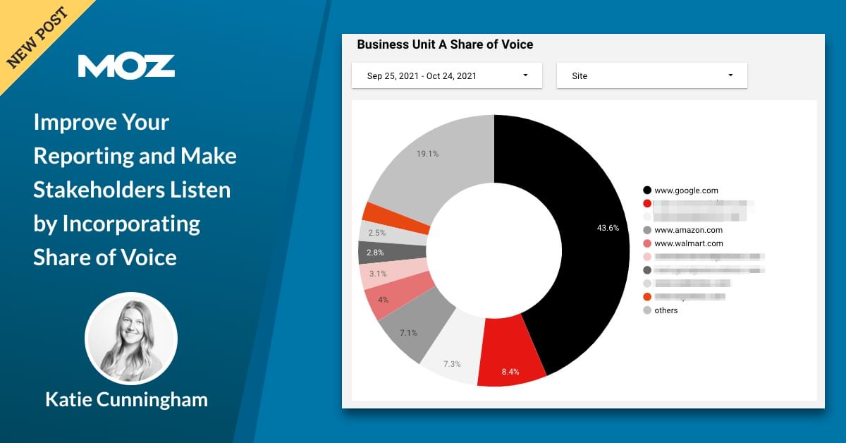
Pie chart
Pie charts are very controversial in the data viz industry. These are generally not a good option since you can’t easily compare the inputs to each other. I challenge that the share of voice is less of a comparison and more of a percentage of total, which is what a pie chart is meant to show, and therefore sometimes utilize them as a quick snapshot. I tend to include a bar chart next to this visual to dive in more just in case, but you do what you prefer.
Follow the same instructions as the bar chart when setting up the visualization.
Table
Tables are simple and effective ways to easily read data. I wouldn’t suggest this as a visual by itself, but it’s great to have as a reference for a chart or for an analyst.
By default the table settings will sum the share of voice metric so make sure you adjust it to be a percentage of total.
Line chart
This would be similar to the out-of-the-box visualization in STAT itself. The difference is that you can visualize in more of an aggregate format and make them a bit more in line with your reporting visuals. Add certain colors to draw attention to your sites or calls-outs as needed. When setting up a line chart, use a simple number versus a percent to make sure it aggregates properly.
Again, these are just starting points, use what you need to tell the right story to your audience.
Take it to the next level
One of my favorite parts of GDS is the ability to interact with your data and customize it on the fly. These are just some quick tips to make your dashboards even more useful.
Utilize filters
Filters allow you to adjust data on the fly. There are two types of filters: a page level filter that can change multiple visuals while looking at the report and a visual level filter that pre-filters specific visuals. Use a page level filter when you want the report viewer to have the ability to dig into the data and use visual level filters for when you want the data to only display the filtered data you selected.
Page-level filters
You can add a filter under the “Add a Control” dropdown. The most common page level filters I use include date range control and dimension filters. You can set up dimension filters to be self-selecting or custom search options. Which you choose depends on what you want a report viewer to have access to use.
For example, adding in a filter for Sites allows you to change the competitors listed in a visual. This can help you remove competition that is making the visuals hard to read (*cough* Google *cough*) or that the audience doesn’t care about.
Visual-level filters
There are different options to apply filters at the report, page and visual level, but all of these are filters that are applied to your visual before it’s created. This customizes the data in the visual to exactly what you want to show versus the report viewer having to self-select.
For example, you could add a visual level filter to only show the sites you have manually added, in case you didn’t want to show the full landscape.
I wouldn’t recommend using pie charts for filtered data, since it does remove key data points from the total.
You can learn more about filter options from Google’s resources.
Create competition groupings
Calculated fields in GDS give the ability to layer data transformations on top of the raw data source. You aren’t modifying the data itself, but instead creating a new value to include in the report. There are plenty of resources to learn how to create calculated fields so I’ll just cover the high level steps here.
Example: You want to visualize the types of competition with the top SOV by site type versus domain. Setting up the following calculated field will summarize the SOV by grouping so you can get an even higher level view of your top competition:
To add a calculated field, open the data source and click “Add a Field” and then add in your custom code.
Make multiple views
Who says you only have to have one report? I’m a huge fan of an internal and external report view. This allows you to set up more details in your internal report while keeping an external report high level and focused on the visuals. Use the internal report to dive deeper and build your insights for the stakeholder-facing one.
For a client-facing report I tend to keep the visuals focused on a specific time frame without the ability to filter. This allows the client to see what I want them to see.
For my internal reports, I tend to include the ability to adjust timeframes, include multiple filter options, and include tables to support my visuals so I can easily download or see the raw data if needed.
Get creative with your data
With tools like STAT and Google Data Studio, you can combine data sources on a common data point. The SOV data source has “Date” as a field, so any other data source that includes a date can be combined.
Want to visualize SOV on the same chart as traffic? Want to combine multiple tag SOV data sources into one? Want to layer published content dates over SOV changes? Get creative and try it out! Might as well start asking if you can visualize something and then see if you, can versus feeling limited to the basics.
We’ve covered how to set up your projects to look at SOV with STAT and how to pull that data into the Google Data Visualization tool in this article. Now go forth and use your learnings to create something custom for your client or business. Remember to focus on the story you want to tell first, and let the data bring it to life.