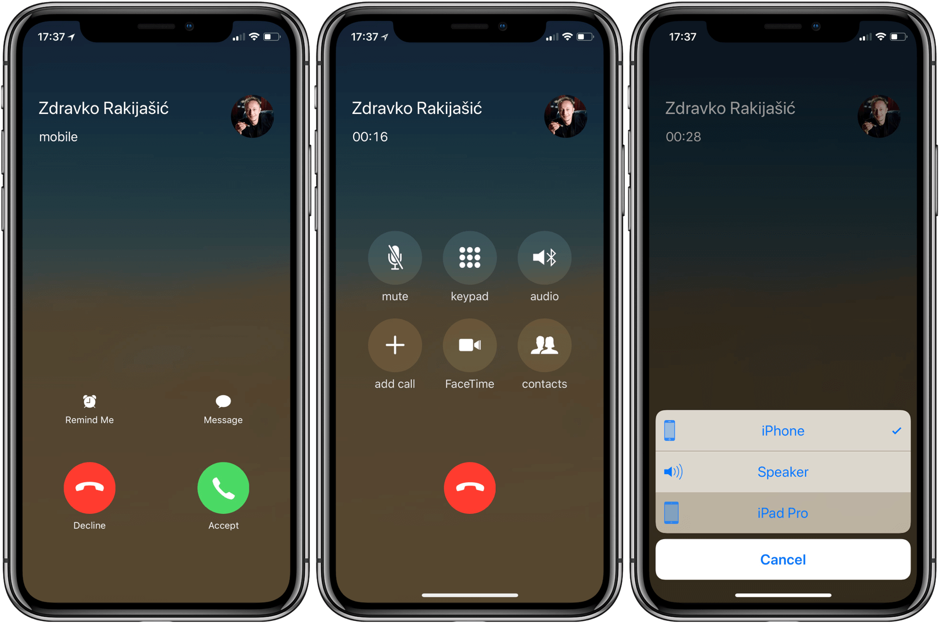
If you’ve got an iPhone and you’re picky with UX, you may have noticed how annoying it is to select the audio output during a call. Sometimes you get a call, and you don’t know where the caller’s voice is coming from: the iPhone speaker, your headphones, your car, or your laptop. Or even if you do know where it’s coming from and want to switch to, say, speakerphone, you start with this button:

You tap on the “audio” button, and you get this menu all the way at the bottom of the screen:

I have a problem with this UX. First of all, I’m holding the iPhone in my [left] palm and I just tapped on the “audio” button which is in the middle right part of the screen. Now I have to move my finger all the way down to complete my selection. Secondly, the icons are tiny, and you have to comprehend what the text says. As a result, oftentimes it takes me a solid 2-3 seconds to sort out the audio situation before I can say “hello” and actually be ready to hear the person.
Here is version 1 of a better concept. Once I design a more perfect concept, I will update this post. But for now, here’s something that would be much better in my opinion:

Share your thoughts below if you have any or tweet @dav917.
